Friday, 28 February 2014

Domain on sell $8

In past we have bought 2 domain and we worked only at one domain with our full attention. Our work reach to it perfection therefore, many of web Blogger want to hire as us. Recently Hammad baig the CEO of Techtutshub and Covershub (Facebook covers) offer us to contribute with him on his blog Techtutshub. We are now so busy that we can not give full attention to our blog. Profeedlinks is the domain where we work hard and now we doing nothing with this domain so we decided to sell this domain and also another domain name called Androidove. We have already listed these 2 domains on for sell.


Why we are selling this Domain?


As we told you above in post article that we are currently working with Hammad Baig the owner of Techtutshub and Covershub (Facebook covers). Actually we do not have enough time to give full attention to this domain blog.

Where to Buy this Domain?


You can buy this domain from Namecheap. This domain is already listed to the namecheap marketplace with reasonable price and you can also make an offer with us. We are waiting for you. Yes you can also buy this domain at any domain site Like: Godaddy etc.

Buy: Profeedlinks.us - Namecheap.
Buy: Androidove.biz - Namecheap.

You can also negotiate with us if you think the price is too high for you. We are waiting for you to buy these domains. Fell free to contact us for more information.


About Post Author:

This post is fruit of pen-clipping of Mohammad Hamza, poineer of ProFeedLinks. He likes to shear about his thought and experience with others.

Read more about Mohammad Hamza »

Wednesday, 11 December 2013

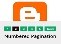
Numbered Page Navigation

If you are not using numbered page navigation, your template consider to old style. Many of the webmaster use numbered page navigation to their site template to make it easier for their visitor to find their desire page in no time. Many of the users are using older and newer post option instant of numbered page navigation. Numbered page navigation is more user friendly, SEO friendly and attractive. Most advance Blogger user used page navigation to make their template more beautiful.

Add CSS code to Blogger/HTML Blog:


  • Go to your Blogger account and open the template tabs right of your Blogger dashboard.
  • Click on the edit HTML and open it. The new window appears with your template codes.
  • Now press Ctrl + F the new light box will appears and put this ]]></b:skin> code in the box and just above this code ]]></b:skin> past the below code.
.showpageNum a {
background: #02ab68;
padding: 5px;
padding-left: 10px;
border: 1px solid #b9b9b9;
padding-right: 10px;
margin-right: 5px;
color: #000;
font-weight: bold;
}
.showpage a {
background: #02ab68;
padding: 5px;
padding-left: 10px;
border: 1px solid #b9b9b9;
padding-right: 10px;
margin-right: 5px;
color: #000;
font-weight: bold;
}
.showpageArea {
float: left;
}
.feed-links {
display: none;
}
.showpageArea a {
float: left;
font-size: 15px;
color: #fff!important;
padding-left: 15px;
padding-right: 15px;
}
.showpagePoint {
float: left;
font-size: 15px;
padding-left: 15px;
padding-right: 15px;
}
.showpageArea a {
text-decoration: none;
}
.showpageArea {
float: left;
width: 363px;
margin-top: 10px;
}.
Now you can change color and size of widgets. with your own. You can use this widget to help you out more further. 

Once you complete the above step  them make your move toward this below step.

  • Go to your Blogger account and open the template tabs right of your Blogger dashboard.
  • Click on the edit HTML and open it. The new window appears with your template codes.
  • Now press Ctrl +F the new light box will appears and put this </body> code in to it to find the correct code.
  • Past these showing code just above to this </body> code.
Numbered Page Navigation Code:

<!--Page Navigation Starts-->
<b:if cond='data:blog.pageType != &quot;item&quot;'>
<b:if cond='data:blog.pageType != &quot;static_page&quot;'>
<script type='text/javascript'>
var pageCount=6;
var displayPageNum=6;
var upPageWord =&#39;Previous&#39;;
var downPageWord =&#39;Next&#39;;
</script>
<script src='http://widcraft.googlecode.com/svn/blogger_pagenavi_min.js' type='text/javascript'/>
</b:if>
</b:if>
<!--Page Navigation Ends -->
Now save your template and refresh your blog and when you revisit your template you will be able to see the numbered page navigation.


About Post Author:

This post is fruit of pen-clipping of Mohammad Hamza, poineer of ProFeedLinks. He likes to shear about his thought and experience with others.

Read more about Mohammad Hamza »

Tuesday, 10 December 2013

CSS3 Apple Navigation Menu

On our previous of most we share with 3D tabs with you and now we are going to share Related to apple website tabs menu. These tabs menu are not much exactly the same but it give much better impression to black theme template. We create this tab for you to make your site even better. In this menu you have images with text label. We hope we have made these tab menu widgets according to your taste.


Add HTML Code to Blogger/HTML Blog:


  • Go to your Blogger account and open the layout tabs right of your Blogger dashboard.
  • Click on the edit widget and open it. Open the HTMl/JavaScript and past the below code on it.
<link href='http://fonts.googleapis.com/css?family=Roboto' rel='stylesheet' type='text/css'>
<link href="//netdna.bootstrapcdn.com/font-awesome/4.0.3/css/font-awesome.css" rel="stylesheet">
<div class='navbar'>
<ul>
      <li><a href="#"><span class='fa fa-home'></span>Home</a></li>
<li><a href="#"><span class='fa fa-file'></span>Resources</a></li>
<li><a href="#"><span class='fa fa-wrench'></span>Tools</a></li>
<li><a href="#"><span class='fa fa-list'></span>Examples</a></li>
<li><a href="#"><span class='fa fa-tag'></span>Tags</a></li>
<li><a href="#"><span class='fa fa-pencil'></span>Blog</a>
</li>
</ul>
</div>
Replace with the link of your page.

Add CSS code to Blogger/HTML Blog:


  • Go to your Blogger account and open the template tabs right of your Blogger dashboard.
  • Click on the edit HTML and open it. The new window appears with your template codes.
  • Now press Ctrl + F the new light box will appears and put this ]]></b:skin> code in the box and just above this code ]]></b:skin> past the below code.
.navbar {
  display: table; /* NOT SUPPORTED IN IE7 */
margin: 20px auto
}

.navbar ul li { float: left }

.navbar a {
  color: #fff;
  display: inline-block;
  font: normal normal normal
        12px/35px
        'Roboto', Helvetica, Arial, sans-serif;
  text-align: center;
  text-decoration: none;
  padding: 0 18px;
  border: 1px solid #5d5d5d;
  box-shadow: inset 0 0 0 1px #8a8a8a;
  background: #4a4a4a;
  background: linear-gradient(#8a8a8a,#707070,#626262,#787878);
  text-shadow: 0 -1px 0 #333
}

.navbar ul li a:hover {
  background: #8a8a8a;
  background: linear-gradient(#646464,#4a4a4a,#3b3b3b,#525252)
}

.navbar ul li a:active {
  box-shadow: inset 0 10px 20px -5px rgba(0, 0, 0, 0.75);
}

.navbar ul li:first-child a { border-radius: 5px 0 0 5px }
.navbar ul li:last-child a { border-radius: 0 5px 5px 0 }

.fa { margin-right: 10px }

/* RESPONSIVE DESIGN */
@media screen and (max-width: 600px) {
  .navbar ul {
    width: 100%;
    display: block;
    margin: 0;
    padding; 0;
    height: auto
  }
  .navbar ul li {
    width: 50%;
    float: left;
        margin: 0;
    padding; 0;
    position: relative;
  }
  .navbar ul li a {
    text-align: left;
    width: 100%;
    padding-left: 25px;
    border-radius: 0!important;
    border: 1px solid #5d5d5d
  }
}
Now you can change color and size of widgets. with your own. You can use this widget to help you out more further. 
HTML CSS and JS Code Creator.

We are done from here. Stay with us or subscribe to us to get more updates and news.


About Post Author:

This post is fruit of pen-clipping of Mohammad Hamza, poineer of ProFeedLinks. He likes to shear about his thought and experience with others.

Read more about Mohammad Hamza »

LinkedIn Share Plugin Button

LinkedIn is now most reliable place for all business people. Most of business website or blog use LinkedIn in case to increase their site traffic. LinkedIn proven its self a better site for all business people either they are on ground level or huge organization. You have already seen LinkedIn developers widgets on business sites which provide flexibility to other corporate business owners. These business person share their though and communicate their related content with others.

Build A Share Button With LinkedIn:


Use LinkedIn share Button on your site to enable users to share your website/blog content to their LinkedIn profile with their audience, and drive traffic back to your site with some new ideas.

LinkedIn share button are available at three different size and shapes. Choose your type and put it on your websites.

Vertical Share Button:


Vertical share button is plane button and on its top you have the option of count per post that how many users have share your content on their profile.

Horizontal Share Button:


This button is related to the vertical button. The only different between these buttons are count box. Horizontal have count button on its side by side.

No Count Share Button:


This button is quite simple button and has no count box. The main purpose of this button is to give you simple plane button without any extra place.

LinkedIn button is now available at 19 different languages. You have the option to choose your own country language to make it easier for your users.

Add Button to Website/blog:


You can add this button to any where in your site but we recommend using this button below the post of your website/blog.

  • Go to your Blogger account and open the template tabs right of your Blogger dashboard.
  • Click on the edit HTML and open it. The new window appears with your template codes.
  • Now press Ctrl +F the new light box will appears and put this  <data:post.body/>  code in to it to find the correct code.
  • Past these showing code just below to this <data:post.body/> code.
Vertical Share Button Code:

<script src="//platform.linkedin.com/in.js" type="text/javascript">
 lang: en_US
</script>
<script type="IN/Share" data-counter="right"></script>
Horizontal Share Button Code:

<script src="//platform.linkedin.com/in.js" type="text/javascript">
 lang: en_US
</script>
<script type="IN/Share" data-counter="right"></script>
No Count Share Button Code:

<script src="//platform.linkedin.com/in.js" type="text/javascript">
 lang: en_US
</script>
<script type="IN/Share"></script>
By Adding this code to its place you completed your job done. Now save your template and refresh your site and when you revisit your site you will see the button which is showing at your desire place.

We hope you have got this post very well. Learn more about configuring thisplugin from LinkedIn site.
By obtaining and using the LinkedIn Share Button Plugins you agree to their Plugins Terms of Use of the Button Widgets.


About Post Author:

This post is fruit of pen-clipping of Mohammad Hamza, poineer of ProFeedLinks. He likes to shear about his thought and experience with others.

Read more about Mohammad Hamza »

Thursday, 5 December 2013

3D Tabs for Blogger/HTML Blog

Blogger has already given the feature of page tabs. Many of the creators have created their own tabs to give new impression and there we created tabs for you to inspire every one. Adding tabs help your visitors to visit your others pages like: About & Contact. These pages help your visitors much to let them understand about your site and works and they contact with you. Blogger tabs menu are out class in 3D world. We have created for you the 3D tabs according to your style. You can style them, color them and reshape according to your template. This widgets is easy to your and customize.

Add HTML Code to Blogger/HTML Blog:


  • Go to your Blogger account and open the layout tabs right of your Blogger dashboard.
  • Click on the edit widget and open it. Open the HTMl/JavaScript and past the below code on it.
<ul class="nav">
<li><a href="#">Home</a></li>
<li><a href="#">About</a></li>
  <li class="active"><a href="#">Blog</a></li>
<li><a href="#">Portfolio</a></li>
<li><a href="#">Contact</a></li>
  
</ul>
Replace # with the link of your page.

Add CSS code to Blogger/HTML Blog:


  • Go to your Blogger account and open the template tabs right of your Blogger dashboard.
  • Click on the edit HTML and open it. The new window appears with your template codes.
  • Now press Ctrl + F the new light box will appears and put this ]]></b:skin> code in the box and just above this code ]]></b:skin> past the below code.
.nav {
  margin-top:94px;
  height: 48px;
  display: inline-block;
  list-style: none;
}
.nav li,   .active {
  float: left;
  position: relative;
  margin: 0 0 4px;
  height: 44px;
  color: #ccc;
  text-shadow: 0 1px rgba(0, 0, 0, 0.9);
  background-color: rgba(0, 0, 0, 0.05);
  border: 1px solid #232428;
  border-bottom-color: #1f2326;
  background-image: -webkit-linear-gradient(top, rgba(255, 255, 255, 0.08), rgba(255, 255, 255, 0));
  background-image: -moz-linear-gradient(top, rgba(255, 255, 255, 0.08), rgba(255, 255, 255, 0));
  background-image: -o-linear-gradient(top, rgba(255, 255, 255, 0.08), rgba(255, 255, 255, 0));
  background-image: linear-gradient(to bottom, rgba(255, 255, 255, 0.08), rgba(255, 255, 255, 0));
  -webkit-box-shadow: inset 0 0 0 1px rgba(255, 255, 255, 0.05), 0 2px #262a2e, 0 3px #1f2326, 0 4px 3px rgba(0, 0, 0, 0.2);
  box-shadow: inset 0 0 0 1px rgba(255, 255, 255, 0.05), 0 2px #262a2e, 0 3px #1f2326, 0 4px 3px rgba(0, 0, 0, 0.2);
}
.nav  li:hover {
  color: #b0d157;
  text-shadow: 0 1px black, 0 0 20px rgba(255, 255, 255, 0.5);
}
.nav  li.active,
.nav  .active:active,
.nav  li:active {
  z-index: 2;
  margin: 4px 0 0;
  height: 43px;
  color: #aaa;
  text-shadow: 0 1px black;
  background-color: rgba(255, 255, 255, 0.03);
  border-color: #212425;

  background-image: -webkit-linear-gradient(top, rgba(0, 0, 0, 0.2), rgba(0, 0, 0, 0));
  background-image: -moz-linear-gradient(top, rgba(0, 0, 0, 0.2), rgba(0, 0, 0, 0));
  background-image: -o-linear-gradient(top, rgba(0, 0, 0, 0.2), rgba(0, 0, 0, 0));
  background-image: linear-gradient(to bottom, rgba(0, 0, 0, 0.2), rgba(0, 0, 0, 0));
  -webkit-box-shadow: inset 0 1px rgba(255, 255, 255, 0.05), inset 0 -1px 1px rgba(0, 0, 0, 0.15), 1px 0 rgba(0, 0, 0, 0.05), -1px 0 rgba(0, 0, 0, 0.05), 0 1px rgba(255, 255, 255, 0.05);
  box-shadow: inset 0 1px rgba(255, 255, 255, 0.05), inset 0 -1px 1px rgba(0, 0, 0, 0.15), 1px 0 rgba(0, 0, 0, 0.05), -1px 0 rgba(0, 0, 0, 0.05), 0 1px rgba(255, 255, 255, 0.05);
}

.nav  li  a {
  display: block;
  line-height: 44px;
  padding: 0 20px;
  font-size: 12px;
  font-weight: bold;
  color: inherit;
  text-decoration: none;
  outline: 0;
}
Now you can change color and size of widgets. with your own. You can use this widget to help you out more further. 
HTML CSS and JS Code Creator.

We are done from here. Stay with us or subscribe to us to get more updates and news.


About Post Author:

This post is fruit of pen-clipping of Mohammad Hamza, poineer of ProFeedLinks. He likes to shear about his thought and experience with others.

Read more about Mohammad Hamza »

Tech News

Social